RSS

Evaluation

So I have finally finished creating my web app for the chosen theme: Porsche. I am very happy with the final product, and feel that I have learnt a lot more than I intended that I would in the process. I have learnt mostly about jQuery mobile and the new lines of code that are available; as I had never used it before. I prefer making a mobile website this way, as opposed to relying on the normal code from a website but restricting the size, because you are given more responsive code which is great for smartphone devices, such as the buttons and lists; two features I have used a lot in my design.

Unfortunately I was not able to succeed in creating an additional version for the iPad/tablets, but this was due to  errors which I could not resolve. I wouldn’t want to pay for the apple license to host an app that will get taken down due to copyright reasons, and the embedding of a PDF file didn’t want to work. This is not an issue though as I have created a web app that i am happy with.

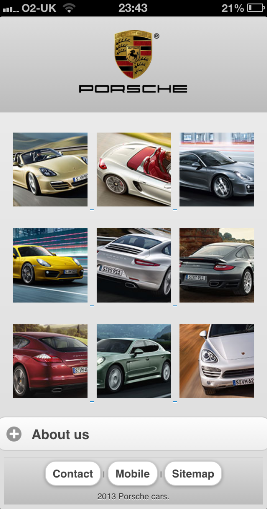
Is it better than Porsche’s current web app? I think it is, for the simple reason that it is more user friendly. Time and time again companies will create something that is standard for the industry, but it isn’t always the best decision. Here I have used a navigation based upon images, which allows the user to have less to navigate through, and is visually more appealing to them. As it is being viewed on a mobile I felt that the amount of text being viewed should be limited, so here I created many collapsible menus so that you can pick what text (if any) you wish to read. The intention of a car website is for quick viewing so you can look at the latest models, and read upon their top speed, horsepower etc. Naturally, there will be the “other” who will view these websites with the intention of buying, and for that I have included the prices, given contact information and optional information to read about the company.

I have tried to adopt to the style of Porsche’s own website with the navigation and design, but I wanted to do something different due to the fact that they already had a mobile version of their website. I haven’t included all of the cars because there are too many for me to avoid repetition in my design to show the overall design, however should this design become of a similar company or for them and wanting to use it for the full range, it would be easy to include the remaining pages. In my design I only chose 9 random cars, however for the full version I would pick one of each model that would act as the navigation picture, and upon pressing it there would be a pop-up menu that would list the models to choose from. I feel that this would be more user-friendly than a list of more lists that open when you choose one, to view the cars available. Mobile websites are all about being visually pleasing, and making it quick and easy to navigate without being bored, struggling to press the buttons or being lost in scroll-able areas of text. I was also going to include a custom icon for the iPhone’s “save to home screen  feature, however I felt that it would be needless as I never do it myself with websites and I don’t feel it would be worthwhile as it’s only one of the many phone brands out there that would have the personalized icon.

To conclude, I feel that my design was a success and fulfilled my initial ideas of the design outcome. I added and changed several things along the way, but for good intentions which in turn benefited the end creation of the web app. It has been a very reflecting assignment, and I have learnt a lot more about website coding from it, which will benefit me for future projects, and updating my own portfolio website. My concerns with the web app is my lack of knowledge in the field, but I have learnt a vast amount from not knowing anything about it, and feel that with more practice I could make something of a higher standard. I am glad that everything functions correctly, and I don’t think that looking back I would have preferred to have chosen a different form of interactive media, as this benefits me for promoting myself on different medias, and has taught me more about coding.

http://jquerymobile.com/test/ has been a digital bible for me in my creation after following the “Dreamweaver CS5.5 Designing and Developing for Mobile with jQuery, HTML5 and CSS3” by David Powers, and showed me a lot of extra features that I have understood and integrated into my final product.

And finally, here is the web app (click the image to be redirected. If you are viewing on a computer or tablet you will be redirected to Porsche’s website and not the web app.)

webapp

 
Leave a comment

Posted by on January 28, 2013 in PCA - Interactive Design


Summary of errors that occurred

After fixing the initial hiccups after uploading my webapp onto a live space, I then continued to finish the design and content of the pages. Here’s a list of problems that occurred and screenshots to explain my process along the way.

The first notable thing I decided to change was the theme. As the logo has black text, it gets lost within the header, so I changed the theme by simply putting

data-theme="d"

in my <div> tag. jQuery mobile has a list of saved theme colours so that you can easily change the appearance to suit your content. Below is a comparison to show the wrong and right theme to suit my design; which also matches to Porsche’s house style of recurring white/grey colours for the layout.

wrongtheme righttheme

The next issue I had was with the set CSS formatting for the pages. Because jQuery mobile relies mostly on one .html file, this meant that every <div data-role=”content”> (on every page that I create), it will assign the images to be the same size as I have done so for the homepage. This means that my plan of creating a larger image to be placed at the top of each car’s page would be impossible. Luckily, you can override the CSS formatting by adding

style=""

to the object/id that you wish to re size differently. I also had an error with the collapsible lists, which was due to another missing </div> tag. You have to regularly check your coding for simple mistakes! Here’s a screenshot of the two errors to visually explain what I have summarized;

csserror collabsibleerror

And this is the result of being able to change the width of the image on another page without blindly editing the CSS, and checking the coding thoroughly;

overridecss

You can see that i have also added buttons to the navigation and kept the black navigation, both for their own reasons;

  • the buttons are far easier to use on a touch screen device compared to hyperlinked text (without accidentally pressing the wrong one)
  • the black navigation won’t be confused as a part of the content, and thus is kept this colour to stand out so you can’t get lost on the pages.

I have removed the iPad link and decided not to continue with it. If I wanted to go ahead with an iPad version, I would need to pay for a license to then publish it on the apple store, and obviously for this exercise I would be facing law suits for copying Porsche and making money from it!

The other alternative was to upload a .pdf and then embed it into a website, which would mean I don’t need to pay an excessive yearly fee to have a license to publish it, and I can easily maintain and edit it. Unfortunately upon trying this path, I came across further errors that I couldn’t resolve. I found a tutorial explaining how to embed a PDF file into a html page (http://www.pdfobject.com/), but this is what my result was;

pdfembedfail

Now this was viewed on my 23″ monitor, and you can see that the PDF seems to be trapped in the top end of the webpage, not stretching to fill the page. The code itself set the width and height of the pdf file to 100%, so there is no reason for this error to occur. It could be an issue with the chosen web browser (chrome) but I doubt it. I also tried to view it on my galaxy note tablet, but the PDF didn’t even display. For this reason, I came to the conclusion that it wasn’t worth putting more time to try and include an iPad version of my web app for the time being, but it will be something that I want to resolve for any future projects.

final_galaxys3 iPhone Retina GUI PSD

PSD phone templates:Galaxy: Eryk   iPhone: Geoff

These were two screenshots taken on different devices to confirm that my design was working. The Samsung galaxy was taken before I changed the footer’s links to buttons, and the iPhone was afterwards. I researched to find code to put the web app to full screen when viewed (as shown below). I felt that adding the full screen option would allow the user to be more likely to continue using the web app another day, as it feels nicer to be on a website without the website URL bar constantly being on the page allowing less room to view on the phone.

Source: stackoverflow

I researched into the top devices for the smartphone category, so that I knew what I should be testing on to ensure that it works, and naturally the samsung galaxy and iPhone were the ones which on average came out as the two main competing devices. Android and iOS are the two operating systems for the devices that are in competition, which is why I focused on the two to ensure that the web app was viewed correctly on them. The research was from 2012, which would have been before the buzz of the windows phone appeared along with the new Windows 8 OS in late October. The Windows phones come in four different resolutions, one of which won’t be supported by my web app. I am not sure if there is code to support this issue, as a tablet’s resolution can be as low as the phone’s maximum resolution (768×1280).

Notable sources from the research include:

DigitalBuzz    GeekWire

 
Leave a comment

Posted by on January 27, 2013 in PCA - Interactive Design


Testing web app on smartphone

I decided it was time to test my design on a smartphone so I could see it live. Unfortunately I noticed that the design had changed dramatically from what I saw in DreamWeaver, in terms of the layout. This is due to the jquery.mobile-1.0.min.css, which had set the design’s “content” <div> to fit “85%” of the device that it is viewed on, which is why all of my images had collapsed from the 3-to-a-row rule that I had created. I changed it to 95% so it allows a more reasonable area for the design to fit in. I have also added extra code in the CSS so that the images will keep the aspect ratio/proportions. It seems that images in the header are restrained to a certain size as my logo is cut off after it reaches a certain width.

livetestwrong

As you can see when comparing this to my previews during the design stage, the layout doesn’t match. The porsche logo has been cut off due to a restriction of the header’s width due to the additional button spaces on the left and right, and the cars are bigger than they are supposed to be.

This was fixed by setting percentages for the widths, and heights to “auto”, so that they keep the proportions, and automatically adjust to the device’s resolution while keeping the layout. This will result in the web app looking highly stretched on a computer, but that’s fine as it’s not intended to be viewed on one. I could possibly create a separate version for the web which loads a page informing them to view it on their mobile device with JavaScript code.

stretchedonpc

This is what it looks like now on my computer, though as you can see from the previous image from the post about creating the homepage that is what it looks like on my smartphone. To amend this visual error on the web side, I will create a JavaScript code that will redirect the user depending on the screen size. The code looks like this;

if (screen.width >750)
window.location.replace("http://www.porsche.com/uk/")

This will check the viewing device’s width, and if it is above 750 (iphone 4 is 320×480, iphone 5 is 640×1136, samsung galaxy s3 is 720×1280) then it will redirect the user to porsche’s website. This is what porsche does similarly on their website, as they have a mobile version for smartphones which you are redirected to. I tested it with a simple redirect to another .html file which had a line of text, and it worked as shown below on my computer and macbook;

webredirectScreen Shot 2013-01-27 at 11.56.30


Leave a comment

Posted by on January 27, 2013 in PCA - Interactive Design


Creating car pages

So i am now creating the pages for the 9 chosen cars from the Porsche website. I created the layout for each page and correct titles but couldn’t figure out why the <href> images on the homepage weren’t redirecting. After analyzing the code that I had written I realized that I missed out a closing <div> tag. Missing a simple error like this means that the website will not fully function properly. It’s one of those things that you spend so much time focusing on creating the content that you forget to ensure you don’t miss to add/close a tag or two. Similarly, if a closing <div> tag is missing on “#page2” or any besides the homepage, it will also not work correctly, because they are all created within the same .html file. A lesson well noted on my behalf for the remainder of the coding process!

Additionally, whilst creating the dropdown menus for the “text” portion of the pages, I came to another problem which was a code issue, but because there was too much of it. I was including this portion of code for each collapsible menu;

<div-data-role=”collapsible-set”>
<div data-role=”collapsible”>

But, by repeating the collapsible-set <div>, it messes up the webpage and causes it to either display a handful of the lists, or just the first one as shown below;

To fix this, I decided to only include one “collapsible-set” and repeat the “collapsible” <div> for each list, which seemed to fix the error.

In terms of the content for the paragraphs, I tried to keep it as simple as possible; specifications, colours available and price. The reasons for this is because of what I keep repeating; people use their smartphone’s internet browsing for quick browsing on certain websites, so they won’t want to read about the years of manufacturing and how they came across to create the shape and design of the car. Here’s a rundown on how many sections they have for each of their categories so that you can get an idea of how much information on each car I am restricting my webapp from, this is only for “Boxster”;

  • Concept – 4
  • Drive – 13
  • Chassis – 6
  • Safety – 8
  • Comfort – 13
  • Environment – 3
  • Colours – 4

What you have to understand is that the majority of the information that will be given on a car website will be generic; giving information such as “this car includes a steering wheel”, and “it is fitted with an airbag”. The information that will be included in my webapp for each page is what you want to know, the top speed, car weight etc.

 
Leave a comment

Posted by on January 25, 2013 in PCA - Interactive Design


Initial live testing

I returned to college yesterday to compare the progress I had made with some colleagues. One friend suggested one of us testing our web app out on web space so that it was live. Upon doing so we saw that the design had stretched, as it does when you preview it locally in a web application. We thought it was odd, as we had designed our app with the starting template for a mobile device, yet it is displaying similarly to the full size website preview. We searched for a similar error on Google  as we were sure it would be a common issue; the mobile web page being stretched when it should be the actual design and not need to be stretched at all.

We found the issue, and the fix was to add this line of code to the head of the .html file:

<meta name="viewport" content="width=device-width"/>

Answer found here

This basically tells the website to change the viewport resolution depending on the device width, which is what I’d have assumed it would do automatically. Everything requires of code to take effect; nothing will appear automatically. Probably something important to note about coding.

This then got me thinking more about what I could do to customize the web app. I did some research and found two features that I could include which would be a nice finishing touch;

  • removing the top search bar – entering full screen
  • creating a custom icon when you “add to home screen” (essentially mimicking the app style of opening)

These are both easy to include; requiring extra code to be placed in the head similarly to the previous function explained above.

The search bar can be removed by adding a line of JavaScript in the <body> tag, or a more comprehensive set of code instead. Optionally there’s a function to remove it on Apple’s Safari by adding 2 lines of code in the <head> tag, but obviously it won’t work on any other smartphone device which doesn’t use Safari.

Source:

To add a custom icon for if a user decides to save the webpage as an app icon on their iphone, the code simply links an image to the code for the device;

<link rel="apple-touch-icon" href="/custom_icon.png"/>

It’s also possible to upload different sized icons all linked to the same <link rel>, given that the iPhone/Touch and iPad will have different sized icons.

Source:

Apple Developer library

 
Leave a comment

Posted by on January 24, 2013 in PCA - Interactive Design


Creation – Homepage

iPhone Retina GUI PSDiPhone Retina GUI PSD

iPhone 4 template by Geoff Teehan

As you can see, I have added more padding to the sides of the images, and increased the size of the text in the footer. This enables the user to have less issues accessing the redirects connected to the text and images, and not accidentally clicking the wrong one because they were too close to eachother, or in the footer’s case; too small.

 
Leave a comment

Posted by on January 24, 2013 in PCA - Interactive Design


Assets

I figured that before making my website I should gain the assets to create it, so that I wouldn’t end up stopping and starting to find images to place, text to use and the like. The images and text were very easy to get, as the Porsche website offers many wallpapers of their cars, which allows me to then re-size them to my desired sizes to reduce the file size when uploading for the website.
Here’s a few screenshots to display my assets before and after the creation of the web app;

assets1

assets2

assets3

I edited some images and regained text along the way (this post has been edited to include the final images of the assets used), which is why the assets list was modified accordingly.

 
Leave a comment

Posted by on January 22, 2013 in PCA - Interactive Design


Creating an additional version for the iPad/tablets?

In last week’s workshop we were shown how magazines are created for the intention of the tablets and the iPad in Adobe InDesign. It seemed like it would be very easy to create, and I thought about the idea of creating a second version of my web app; for the intention of being used on a tablet. This would allow more users to access the information that I am creating for smartphones. In the industry it would be expected for the creation of a website to cover all forms of technology that we use to access the internet, which would mean that creating the magazine afterwards would be good practise for me.

It’s just a thought but if I have enough time after creating the web app, I might create a magazine version for the tablets. With the previous experience with adobe InDesign, it should be a lot quicker to create than the web app, as I will already have the resources, and the knowledge to create it.

 
Leave a comment

Posted by on January 14, 2013 in PCA - Interactive Design


Learning the design process: Dreamweaver CS5.5

David Powers, Dreamweaver CS5.5, 2011.

I was recommended a book by David Powers, “Designing and Developing for Mobile with jQuery, HTML5 and CSS3”. The book displays a step by step guide to creating a mobile website/app. This will benefit me to gain a better knowledge of how to create the structure for a web app. I have learnt a lot from the workshops up to now, and have learnt that in the newer versions of Dreamweaver, creating a website has become much easier than when it used to be all about the coding!

I will now work through the book to create a working web app, and product me results and evaluate what I have learnt, so that I can then begin drafting and creating the web app for my chosen theme.

The book was fairly straight forward, however I came across several issues due to working with a newer version of Dreamweaver  and possibly the mobile templates/jQuery files having differed since the book was created. Here’s a list of the issues that I had:

  • I had to manually add back buttons, as in CS6 they need to be enabled through the jQuery functions panel
  • Back buttons don’t automatically create themselves, and when loading external pages from index.html the back buttons it says will be created do not appear.
  • Clicking on the image does not load to the next page as the “href” is placed after. However, you are told to place the image first to allow auto re-sizing, which does not function correctly as displayed in the book.
  • As it mentioned that it should automatically create back buttons when browsing (though in the version I used from CS6 I had to manually create them on each page), it stated code which would be useful to prevent the homepage from being given a “back” button (data-backbtn=”false”) which would be inserted to the div for the header. This however is beneficial if it does work properly when taken to a live web space, so I will keep it in mind with my design.
  • Later it explains how to add an icon for the back/home buttons. Upon doing so the images were not added, for reasons which I don’t know, as the coding is the same as the tutorial’s finished version.

Having issues from following basic tutorials can become very frustrating as the code is the same, and I don’t know why it would not work, other than the external files differing and how mobile websites/apps work compared to when the book was made in 2011 to now. I guess this is why it is always better to use the tutorials as a starting point to your experimentation to create something; a theory I had when I began graphic design and teaching myself how to use some other programs from the Adobe suite after seeing what others had created and watching online tutorials.

I had to research on the internet about why the automatic “back” button had been disabled in the new version of Dreamweaver. I came across a forum topic on Adobe which explained that it was not due to Dreamweaver but a change in the jQuery JavaScript file. They mentioned a website that explains how to “re-enable” the feature, that also explains many other functions with mobile websites that I found to be very useful jQuery Mobile

I have gained a lot of useful information from the book; and been able to learn what I wanted about creating mobile websites, as without it I would struggle to find the specifics that I would want to know for where to begin making one.

img_tut1img_tut2

img_tut3img_tut4

I have learnt that working from the template and not redirecting to additional .html files has worked out to be more reliable than redirecting to other .html files. That may have been the coding, though I followed the tutorial in the book so it shouldn’t be. I will need to look further into automatically re-sizing the images; there is probably another function which is turned off by default. If I can’t amend it then I will simply re-size the images manually, which is not a problem.

I now feel capable of creating the mobile website, since following the tutorial to create a basic website with a navigation page which links to other pages. I have also read up to understand what further you can do, such as animations when you click the navigation links, adding collapsing bars and more; so that I can get a good idea of what my website will look like and what is available to include for functionality on a smartphone.

 
Leave a comment

Posted by on January 2, 2013 in PCA - Interactive Design


Chosen theme: Housestyle and ideas for interactive product

I was hoping that Porsche wouldn’t already have created a mobile version of their website so that my ideas could be entirely based upon my ideas analyzing their website initially. But now knowing what they do have, I see what I could create if I had more knowledge with creating websites for mobile.

You can see the images taken of the mobile website below, and will be able to notice that the style is still consistent with the main website version. This is something that is very important with a business when you create something for them which will be used on multiple devices. It’s a similar idea to what I was thinking to create, so my ideas haven’t been swayed entirely.

mobile_porsche2mobile_porsche3

I spent some more time comparing the mobile version of the website to the original, and there isn’t really anything to fault it on with making them relate to each other  This version is the main portion of the original website on a mobile, without the large background image of a Porsche and empty areas on the sides and footer of the web page. This means that I will need to create something different, or create something similar which isn’t an exact copy of what has already been created.

Here’s a view of the layout compared with my new idea;

Porsche web design Porsche webapp design

You can see that the website itself is very basic, which I feel is what it should be for a website designed for smartphones. I have decided to go for a gallery style website, where the user will click on an image and be redirected to a specific page to that image; here being the chosen Porsche model. There will also feature a menu underneath for general information such as contacting, finance etc (the categories displayed on the original website). I intend to add a button to post on facebook/twitter as this seems to be a regular occurrence on the business websites that I have researched, and also appears on Porsche’s website.

There is a total of 32 different cars that Porsche display information about on their website. For the purpose of creating a web app I will limit the number for my design to 9, so that it can fit to my initial design, and restrict myself from making the design become a copy and paste job for the majority of the work.

Do I feel that the design I have adapted to from the original is better than the current for the purpose of a website on smartphones? Yes, simply because the navigation is quicker and easier to find what you are looking for. As I have mentioned time and time again, you use the internet on a smartphone for quick browsing, so you want there to be a deal of functionality on the websites that you visit so you can spend less time trying to click the right button or view an image you can’t find. I admit that a list of the cars is as simple as it could get, but I think that by relying on an image of each car as a substitute of this, it would be visually more appealing to the public, and thus would make this version used more than possibly what it is currently.

The main issue with a mobile website is the buttons. If they are too small then it will become frustrating to use, but if they are too big then it will look ugly and like a set of “tetris” boxes rather than a website. But considering the reduced screen resolution and size compared to viewing it on the computer, you do have to adapt, and allow for a lot of the text information and wallpaper images of the cars to be removed. The reasoning for this is that you would be forced to do a lot of “scrolling” and “pinching” to read the text and zoom in on the images. This will result in the webpages being slower to load, and you’re eyes can become easily tired when having to read lots of text from a smartphone device. This is why I intend to create a simple web app, with boxes containing an image of each of the 9 chosen cars, as opposed to a scroll-down list. There will also be a drop down menu that will feature the additional information, such as is included on the main website so that there is a continuity; meaning that you can view the web app I am creating and instantly recognize it with Porsche  but also not feel you have to view the website version to get information that wasn’t available here.

Given that I was making this web app for Porsche officially with this design, then the boxes would contain each type of Porsche car, that would then redirect you to a list similar to that of their current design, to pick the version of that type of car. This would mean that all 32 cars aren’t featured directly on the homepage; cluttering up what you want to be very basic.

The following pages for when you click an image to view information about the cars, will be much the same to the current pages. My intention was to include a slideshow set of images for the chosen car, and a list of categories to view information about the car. However, as you can see this style has already been applied to the current website, so I will need to vary things up a little so that it is not an exact clone of the original.

 
Leave a comment

Posted by on January 2, 2013 in PCA - Interactive Design