RSS

Mobile websites: The good and the bad

Since the mobile web has taken off with the popularity of smartphones, and more recently apps, websites have been creating an app version of their website, allowing more functional gestures and extra effects/functionality to their website that just viewing the website through the web browser on the mobile would not allow. This makes it easier for the companies to connect with their customers; allowing them to notify the user when an offer is on, or certain stock is available. You can enable notifications, regularly upgrade the app for whatever reason, and quickly access your favourite places, staying logged in and the fact it will be more compatible for your specific device, rather than being made for the whole range of smartphones/tablets.

Here are some examples and comparisons with their computer version, mobile version, and app if it is available:

mobile_facebookapp_facebook

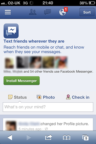
Displayed here is the mobile version of the facebook website, and the app for the iPhone. The difference isn’t great, they’ve just allowed more interaction with the touch screen, so that you can swipe left-right to view who’s online to chat to, and your navigation sections (friends, messages, news feed etc.). The main reason for facebook to become an app, is to that you can receive up to date notifications automatically when you are messaged/tagged/invited to something from there. With the website, you are restricted to being given notifications by email, which will only be given after each scheduled scan for new emails (hourly, daily etc), which drains battery and doesn’t always display every notification that you receive; it’s very unreliable in comparison to the app.

mobile_footlockerapp_footlocker

FootAsylum has created an app version of their website for the same reason; functionability for smartphones and notifications. You can see that the most notable difference is the search bar at the top and the footer navigation. These features work very well in an app, but possibly not so much on the mobile website as it would require additional coding which isn’t available? I’m not sure, but comparing the two, I would rather use the app, so that I can keep up to date on a website which I visit regularly.

mobile_o2

O2’s mobile website I found to be very frustrating and difficult to browse on. They seem to have taken the creation of a “mobile” version of their website quite literally; and shrunk the width of the original down to fit the smartphones. This results in a very long page which makes you spend a lot of time scrolling to figure out what is going on and where things are that you are looking for. I recently tried to use this to try and top up my balance on my o2 sim, and found it hard to do so compared to the original version on the computer. This same version is forced on tablets; making it impossible to sign in to top up, as the feature doesn’t work. It is incredibly annoying to want to use the tablet/phone to lie down away from the computer chair to do something and having to revert back to old methods to complete a process.

mobile_ebayapp_ebay

eBay’s app is very different to their mobile website. There are many extra features such as scanning a barcode, a running number of watching/buying/selling at the top, and notifications when items are ending etc. The mobile website is very good; which is a tidy version of the actual website, looking very similar. The app however makes the website much easier to navigate and do what you desired, as you can search, watch an item, bid, and contact sellers/buyers easier. The notifications that you receive from apps is what generally makes them better than the mobile website, but here you can see that it also has a nicer appearance and has what you need where you need it, instead of having extras such as “popular categories”, as shown in the mobile website version.

mobile_dabs

Dab’s mobile website is a mix of o2’s and eBay’s; you get the functionality of nicer looking buttons and the like to access what you need to for buying/selling, but you are given excess data, with a long scrolling list of “hot deals” to navigate through before you do anything. This is the same as on their main website so in that sense there’s nothing to criticizing it on, but mobile websites should be cut down on the information so you can quickly process information and do what you wanted to. I feel that mobile phones are used less for internet browsing, and more for socializing  When you do use the internet, it’s usually to quickly search for something or to buy; rather than spend hours browsing through a website.

mobile_porsche

Porsche’s mobile website does exactly what I expected of a website designed for smartphones. They have cutdown on the information, and made it easy for quick browsing to find what you want. The homepage has a list of each version of their car, and then a submenu of the model for each version. You are then redirected to a page which gives you written information on the chosen car and a slideshow of images. It does what was intended and you can’t fault it. It’s a shame that my theme is Porsche, I should have chosen o2 or Dabs!

 
Leave a comment

Posted by on January 2, 2013 in PCA - Interactive Design


Website deconstruction

I originally thought that the website’s style would differ depending on the country, as some like to have a different website to, say America from the version for United Kingdom. From experience this is often for Clothing/food websites, simply because the nationality may have a different type of audience to target in a certain way for advertisement. Here’s some examples;

KFC | http://www.kfc.co.uk | http://www.kfc.com

Website_KFCUK Website_KFCUS

McDonalds | http://www.mcdonalds.co.uk | http://www.mcdonalds.com

Website_McDonaldsUK Website_McDonaldsUS

Footlocker | http://www.footlocker.com | http://www.footlocker.eu

Website_FootlockerUS Website_FootlockerUK

So you can see that depending on your location, you are given a different website. The website will generally change depending on the seasons through the year, but both regions’ websites differ dramatically here. The difference in target audiences is a large separation due to the cultures that they live in. America seems to rely a lot on using celebrities to advertise their products, aswell as relating products to the sports and heavily focusing on social networking. We are slowly catching up with them though.

They also differ with several car websites, such as Honda, Volkswagen, BMW and i’m sure many more. The interesting thing here is that some of them will try to copy eachother, but will have certain different style aspects such as the positioning/choice of images and background colour.

Examples:

BMW | http://www.bmw.co.uk | http://www.bmwusa.com

Website_BMWUK Website_BMWUS

Honda | http://www.honda.co.uk | http://www.honda.com

Website_HondaUK Website_HondaUS

Volkswagen | http://www.volkswagen.co.uk | http://www.vw.com

Website_VolkswagenUK Website_VolkswagenUS

BMW is an interesting one; the style is almost identical, but the UK version has a larger navigation and text; maybe we find it harder to read on their site and they changed it for that reason? This same theory applies with Volkswagen’s website, it’s bizarre why they would change the font size for one version of their website depending on the region. They also include a completely different name for their website instead of it just being the domain’s country code. Stereotypes and general assumptions tend to have a big effect on the appearance of websites, as creating a website by them will in turn create a stronger reaction which will result in the advertising to be successful.

Porsche is one of the few major brand companies that I have come across which have an identical website regardless of your nationality. You are initially brought to a splash screen which gives you the option to pick your country, and then you are redirected to porsche’s website displayed in the nationality that you have chosen. If all websites were like this then there would be a lot less confusion over the web, but you can understand that other companies alternate the website’s visual style to advertise better for the chosen country.

Porsche | http://www.porsche.com

Website_Porsche

Ferrari also adopts this format, but I would assume that the reasoning is that they do not require different tactics to advertise to the public in different countries, as everyone knows their cars the same; luxurious, expansive, fast.

Ferrari | http://www.ferrari.com

Website_Ferrari


To conclude; food and automobile websites are designed for quick browsing, therefore they will generally be displayed without a scroll bar  so that you can view large images, and click to the next one. Scrolling generally seems to be for online stores; such as clothing, groceries and furniture. It seems odd however, when certain websites are almost identical besides font/navigation sizes. I can understand the overall colour choice differing and choice of images, but it feel as if they are being picky with which nation they make more of an effort for. This theory could also be evaded due to the fact that some companies have completely different domains for each nation, which could mean a different website designer created each one.

 
Leave a comment

Posted by on January 2, 2013 in PCA - Interactive Design


Interactive Design – Initial thoughts

This module has a slightly bigger choice of interactive media that I can create and programs to use than the Motion Graphics module. From the beginning I decided to choose Porsche cars, because of their clean, stylish design which suits my interests of design, but also because there will be a lot of assets for me to incorporate into my interactive product due to how big they are in the car industry. I thought that I would either make an application for android, or create a web app. I decided against the alternatives of a website/iphone app for separate reasons; A website would become a repeat of another brief we have, and it would be difficult to create something different when the chosen theme already has a perfectly functional one, and iPhone apps require you to buy a license which costs around £100 per year. The use of web 2.0 is becoming rapidly dependent on mobile technology, to the point where people will rarely sit down on a computer to visit a website or do what they normally would, because it is all available on their mobile phones. This is why for me, I feel that creating a web app would be the perfect choice, so that I can stay up to date with how technology is evolving. It will also give me an idea to learn more about it, as I was unaware of mobile versions of websites and web apps being such a big deal. It’s one of those things you often don’t think about because you are easily consumed by all of the different technology that is available to you.

The next stage for me is to begin looking at Porsche’s website to get an idea of their housestyle and what kind of assets I can include into my interactive media product. From there I can draft a design and figure out some ideas of what I will be making. I will also need to compare the style to similar websites, and look at web apps for companies to see the general style and what features they include.  I will have to be careful with the design; such as the font type/size and the choice of images, taking into consideration that the final product is for the intention of being used on a mobile phone rather than a computer. This will mean that I will have to test my web app whilst creating it to correct any sizing errors I may create.

 
Leave a comment

Posted by on January 2, 2013 in PCA - Interactive Design


Evaluation

Being tasked to create an advertisement for a product, I chose the product of a cleaning spray, as a branch-off to Powerade. I had intentions to include more than I did, but due to the limit of time I had given myself and comparing it to Powerade’s own adverts I chose not to include them. I wanted to include some typography to form the shape of the product, but Powerade focuses more on showing a live showcase of the product in action, and uses words to describe it at the end and during.

I feel that besides what had not been included, I was able to follow the storyboard through and achieve an animation that I intended. The most successful part would be the intro, with the animated radial stripes. The video was more of a learning curve for me, as I had previously used flash for a game. I did learn new things however, most importantly how you can convert an image to a movie clip, and by entering the movie clip and converting the image inside to a graphic and animate it, you can then have it as an image you can repeat at different stages in the animation, and also include different sizes/colours of it, but keeping the animation the same.

I feel that it could have been improved a lot, which had become a downfall mainly because of myself. I didn’t give enough time to achieve what I wanted, and thus was not able to include any audio and further research. I chose a safe kind of animation rather than the “onion skin” or stop-motion. With the choice of animation I feel that it worked and I was able to create something effective. I would have liked to create something longer as it just reached the 20 second requirement, and I could have experimented with a different technique to make things a little more interesting.

 
Leave a comment

Posted by on November 5, 2012 in PCA - Motion Graphics


Finishing touches

So with the animation complete, I decided to check it over for any errors, or to see if there was anything I could think of to add. I decided to add an animation for the spray object to appear on the screen, and created a final screen. The final screen is somewhat a generic one, as it displays all the information about the product/company/contacts.

I felt that the animation lacked the addition of text for the majority of the video until it reaches the credits. So I decided to add some keywords to appear whilst the water is sprayed from the product, as it is the perfect time for it.

The glossary in Flash makes it easy to add simple code into the animation, without having to begin with ActionScript 3 to implement code.

I had the intention to create a voiceover to support what is being shown on the screen. It’s standard for promotion adverts to have a voiceover to explain what is being shown on-screen, so it is more of a requirement than a last minute addition. I decided to include a small bit of code to stop the animation looping and replaying the video through constantly. I was restrained to time in the end for it and could not include it.

 
Leave a comment

Posted by on November 5, 2012 in PCA - Motion Graphics


Creation

When I started the creation, I thought I would start a fragment of the animation at a time, so that I can get each bit done one step at a time, so I don’t make the mistake of over thinking it all from the beginning and creating more problems for myself. My initial thought to have some type of typography to be animated and form the shape of the product was removed, as I felt that now I had chosen a brand to cater for, it would not suit the general style of their adverts to have it.

I had a few learning curves along the way, such as figuring out the spiral rotation, and the water washing effect. I realised that to simply have 2 key frames and have a motion tween, while making the second key frame be rotated 360 degrees will not rotate the image. To do so, I had to have several key frames, and have them rotate the same amount of degrees for the same duration, which would in effect create a full 360 degree rotation. I managed to create an accidental effect where it rotated again, thus giving a glimpse of the kitchen image before the stripes had disappeared  I’ve found that a lot of the time you may have a plan set in stone for how it will look, but you will end up creating something by accident that you will use for your creation.

The wash effect with the water was possibly the most difficult part for me to get my head around. I was trying to think of how it could be done, to show the kitchen being cleaned and the clean version of the kitchen to appear on the other end. Instead of playing around with masking and most likely not creating my desired effect, I decided to go with a right-to-left animation of an image to represent water, to have it then fade out into the image of the clean kitchen.

There was another issue when I was sizing my images. When I did hold shift and dragged to change the size but keeping proportions, it didn’t re-size from the center of the image. To fix this, I hovered over the center of the image where there is a dot, right clicked and chose “set transformation point”, which fixed the error.

To conclude, I feel that the creation of the animation was smooth, and I learnt a few new things along the way, as explained above. I am happy with how it turned out, and think that I was able to bring my storyboard to reality, given that how the final product looks, is how I had imagined it.

 
Leave a comment

Posted by on November 5, 2012 in PCA - Motion Graphics


Assets

Before creating my animation I decided to design all of the assets that I intend to be using for it. Here’s a list of what I will be needing:

Vector artwork from Adobe Illustrator:

  • Typography shape
  • Spray
  • Radial stripes (2 colours)
  • Kitchen (clean and dirty versions)
  • Water wash
  • Stars
  • Logo

Artwork created directly from Adobe Flash:

  • Text (slogans, overlay messages)
  • Background colours
  • Saturated background colour

Additional assets:

  • Sound files
  • Voiceover

Creating the logo required me to search for what the font was called. I used a website called “What the font” (www.myfonts.com/WhatTheFont). By uploading a black and white image of the font’s letters, it then searches for the font and gives a match of different possibilities. The font was found and named as “Bitsumis”. Most companies brand their logo from a font, but change a few letters slightly so that it can be classed as something unique. I noticed that the P had a similar effect edited to what the capital R looks like. This was a simple edit in Photoshop, and I was able to re-create the logo in a big enough size to convert as a vector for Illustrator/Flash.

 
Leave a comment

Posted by on November 5, 2012 in PCA - Motion Graphics


Storyboard

Storyboard

 
Leave a comment

Posted by on November 5, 2012 in PCA - Motion Graphics


Branding of the product

I realised that creating a completely new brand for the product may take longer than the time I have to produce the animation, as I would have to create an identity, logo and colour theme for it. If I work with a brand that is already active, I can mimic their logo/colours and save myself the time. It will make things easier too, and would become an adaptation to the “what if”.

I’ve decided to go with powerade, as during the initial stages of creating the assets I started to think of colours. Powerade focus on different coloured drinks for the different flavours, and I could do a similar thing for different smells of the cleaning product I am advertising.

 
Leave a comment

Posted by on October 25, 2012 in PCA - Motion Graphics


Researching ideas for animation

I decided to start looking into the designs of others who have created work which relates to what I am hoping to achieve. I have seen this style of text animation a lot lately, but didn’t know what it was called until now. It’s titled “Kinetic Typography”. Kinetic being part of the name is to mean that it is moving text, so you can interpret that however you want to and still relate it to this theme of animation so long as you use text only. It has most commonly been used or enhancing simple pieces of media, such as a voice message, or creating an interpretation to a music video. The different sizes, colours and animation effects should create the representation for the chosen word each time.

Shop Vac

This video demonstrates a wide range of techniques that are available with Kinetic Typography. They have used graphics and text to animate in relation to what is being described, and also in some cases, made the 2D artwork appear 3D.

http://www.crookedgremlins.com/09/01/2008/kinetic-typography-tutorial/

A channel on vimeo dedicated to kinetic typography:
http://vimeo.com/channels/kinetictypography

After Effects Template – Mega City

This video shows how you can include typography, being placed on top of video footage and making it look like it is part of the original footage.

“What’s he building in there”

This video demonstrates using typography to form the shape of objects. This relates for my project as I hope to create kinetic typography which will then form the shape of the product being advertised.

 
Leave a comment

Posted by on October 22, 2012 in PCA - Motion Graphics